Ways To Take Your Trade and Construction Website From Mess to Success.
Your Trade and Construction website is going to do a lot of the heavy lifting for you when it comes to building your brand and marketing.
When designed correctly that is.
It is the ‘go to’ place for your future potential clients to find out more details about your business (in your absence) and if you are the right team for them.
Even whilst you sleep. Good stuff.
So, it’s crucial that your website is a well-oiled machine.
And represents you in the best way possible when you are not there to charm in person.
Easy to use and quick to find what we’re looking for.
If you want us to make contact and enquire, that is.
The alternative?
Trying to work your website frustrates us.
And what does that mean?
Back to Google we trot and onto your competitor’s website we go.
So, here’s a list of game-changing tweaks to make to your Trade and Construction website to go from mess to success.
Let’s start with the big one first...

1. Use separate service pages on your Trade and Construction Website design.
This one is huge.
Such a game-changer for your website.
So, what do I mean here when I say to separate your Service Pages?
Example.
You’re a Property Maintenance Company.
You offer Roof Repairs, Plumbing, Electrical Services, Gardening and Cleaning.
❌ Don’t create a ‘SERVICES’ page for your Trade and Construction business and put all the information about them all on this one page.
No.
Create a separate website page for each service.
Roof Repairs will have its own page.
Plumbing will have its own page.
Etc.
This doesn’t just work for maintenance companies – where the services are completely different.
Perhaps you are a decorator.
You offer Painting, Wallpapering, External Decorating and Spray Painting.
Well, each of those should have their own page.
And here’s where it gets extra sexy.
Hold onto your Hard Hat.
If you serve both Residential and Commercial clients, then you should separate those pages out too!
Example.
Let’s use the decorator again.
You’ll have a website page that is for Residential Painting.
You’ll also have a separate website page that is for Commercial Painting.
You’ll have a website page that is for Residential Wallpapering.
You’ll also have a website page that is for Commercial Wallpapering.
See how it works?
There are tonnes of reasons why you should do this instead of bundling everything together on one page.
And here’s why…
✅ Your website design becomes more streamlined and easier to use.
✅ Separate service website pages makes it easier for us (potential clients) to digest information as it’s focused and broken down.
✅ Easier to digest means easier to understand. So we are more likely to uncover that you are able to help us and then enquire with you.
✅ It is quicker for us to see all the services you offer in a list (rather than endlessly scrolling on one page) which means it’s easier to upsell.
✅ You can direct enquiries straight to a certain service page on your website (as part of your quotation process) to show specific example work which can help convert.
✅ You can use each page to go into more detail about that service.
✅ You can include specific images, text, video, and testimonials to position you as the expert of these services on those website pages.
✅ Google will love you more for it. You’re giving your SEO a much better foundation if you separate your services on your website.
Small change.
Colossal difference.
💥
2. Make your contact details easy to access from any page on your Trade and Construction Website.
Another easy one to action.
There is nothing more frustrating than when we are on a website, know we want to contact the business, but must keep jumping around the website to get the details.
Or wait ages for your CONTACT page to load up so we can find your email address, phone number or fill out an enquiry form.
Best thing to do?
Put your contact details in the FOOTER (that’s the bottom part of your website that appears on every page).
That means, no matter what page your visitors are on, they have quick access to contacting you.
You want to make contacting you as quick and easy as possible.
You may even like to consider putting your phone number at the top of your website too.
So that as soon as clients land on your website (in case they were searching you on Google) they can get straight on the phone to you when they’ve seen something that has sparked their interest.
Nice.
3. Use testimonials on every page of your Trade and Construction Website design.
A Trade and Construction website without tonnes of client reviews is about as useful as a chocolate fireplace.
There’s no point telling us how good you think you are.
We only want to hear it from satisfied clients.
Your website has so much potential for sharing reviews.
If you don’t have any reviews on your website right now, then I highly recommend that the very next thing you do after reading this, is fixing that.
When we design websites for our clients, we look to feature at least 1 review on pretty much every page.
I see a lot of Trades create a Reviews or Testimonial page on their website.
This is a great start.
But there is an issue with this.
What if a client visits your website and doesn’t go to that page - maybe they don’t see it or just don’t visit the page?
Then all that praise and all those relatable stories/extracts can’t influence them to choose you.
I’m in favour of a Reviews or Testimonial page ONLY if you do this also.
Scatter your Trade and Construction reviews across your whole website.
Maybe the Review and Testimonial page can have the full length versions.
But every page on your website should ideally have at least one review.
That way, no matter what page your potential client lands on (it is not always your homepage don’t forget) then they are seeing how you, your team and your services are being validated by actual clients.
Go one better with my biggest review tip for Trade and Construction websites.
Place specific client Reviews on specific Service pages of your Trade and construction website to back up the projects or services you are showcasing.
🤔 So you have a page on your website for Herringbone Flooring, as it’s a flooring type you want to specialise in?
🙌🏽 Then show us a review ON THAT PAGE from a happy domestic client of whom you’ve serviced this style of flooring to.
🤔 You’ve got a page on your website for Commercial Painting for Restaurants?
🙌🏽 Then make sure on that page you have a review from a happy restaurant owner of whom you painted their walls.
🤔 Want to start working with more Film studios for your Rubbish removal business?
🙌🏽 Well, if you are going to have a page on your website telling us how you do exactly that, make sure you have a happy client testimonial on there to back it up.
This goes hand in hand with our first tip – creating separate pages for each service in your Trade and Construction business.
This will make it really easy for you to know where to put each testimonial.
It will also make it very clear which services you haven’t yet collected a testimonial for.
So you can get on with filling that void.
To have a glowing review, singing your praises, for every single service you want to promote in your Trade and Construction business is the pinnacle for your Trade and Construction Brand and Marketing.
Website organisation at its finest.
It's all pretty straightforward really.
Not rocket science. 🚀
4. Don’t clog your website header with Social Media Icons for your Trade and Construction website.
When a client lands on your website you want them to be greeted with the following:
🟡 Who you are.
🟡 What you do.
🟡 Who you serve.
🟡 Where to go next.
And all this needs to happen in 3 seconds.
Tough?
Not if your website is designed correctly.
And making sure those 4 things happen as fast as Usain Bolt can say ‘100m Sprint’ means making sure the top of your website is uncluttered with unnecessary stuff.
And that includes your social media icons and links.
I’m a firm believer that social media icons should not be promoted at the top of your website as the first thing potential clients may see.
Why?
❌ They can distract from the important info – who you are and who you serve.
❌ As much as you want to grow your social media following, you do not actually want to encourage visitors away from your website. You want them to stay on as long as possible. Keep Google happy.
❌ They clutter up the design and can confuse visitors as to what to do next.
Best bet?
We always add the social media icons and links in the FOOTER (the very bottom part of a website).
In an understated way.
So those actively looking to see if you have social media channels can see that you do (no matter what page they are on – the Footer stays the same on every page).
But it doesn’t detract from all the detail your website is going into about your Trade and Construction business.
5. Use your website footer design to navigate to other pages on your Trade and Construction website.
How many times has this happened to you?
You go onto a website for a product or service that you’re looking for.
The design is decent.
You start reading the Homepage and scrolling through, taking in all the details.
You then must scroll back up to the top of the website to get to the Menu bar so you can start looking across the website at other pages.
You find a page you’re interested in.
Start reading and scrolling.
Then must scroll allll the way back up to the top to get to the menu again.
Next page.
Scroll through.
Then must scroll allllllllllll the way back to the top again.
Tiring.
Frustrating.
Your fingers are getting bored.
We want our information quickly, easily and with little effort.
🔴 Don’t make the visitors to your Trade and Construction website have to scroll all the way up to the top of the page to find the Menu button every time they want to move to a different page.
The best thing to do is to put links to your main/important pages, in your Footer.
That’s really what it’s there for.
Take a look at our decorating client’s website design: www.primadecor.co.uk
Scroll down to the bottom to see their footer.
You can check it out here too:
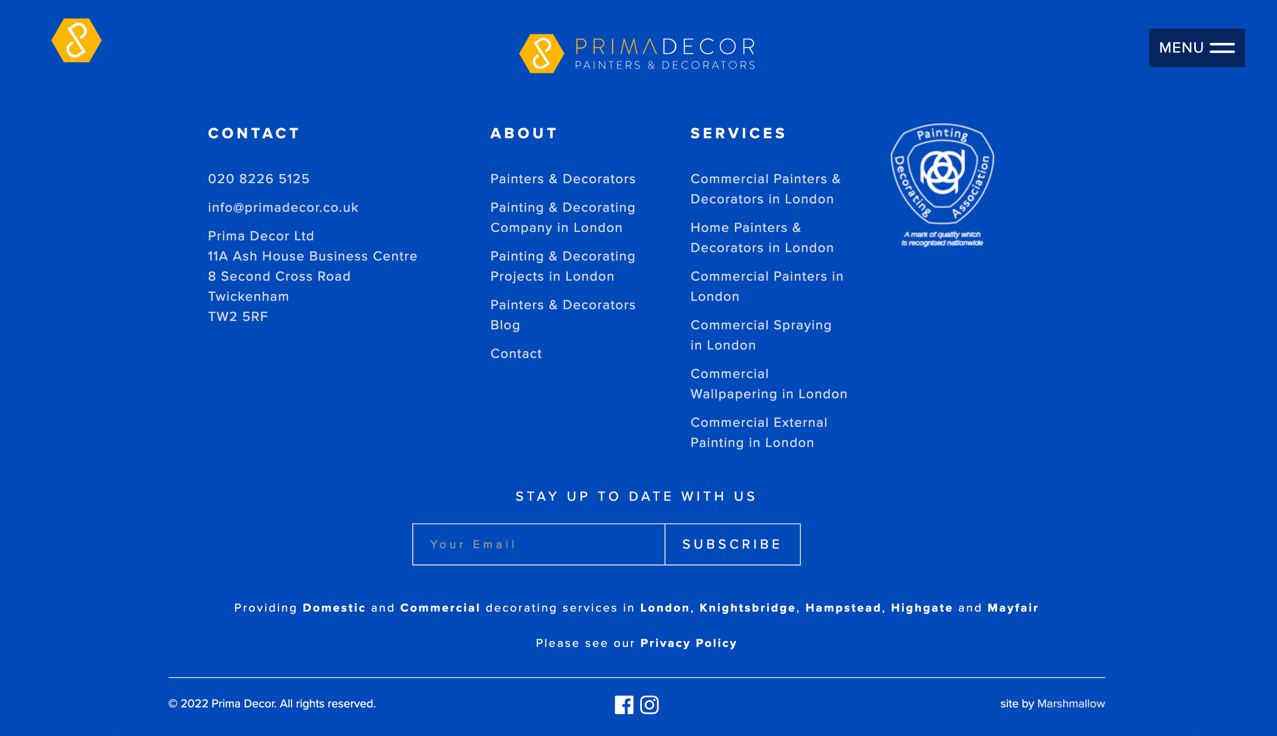
So, this is quite a meaty Footer.
But that’s a good thing.
It has links to contact details.
Social media details.
And links to all the other main pages of their website.
What does this mean?
That when you are on our client’s website and scrolling down a page, when you get to the bottom you can choose where to go next.
Without scrolling all the way back up to the menu bar.
⭐️ It’s also a great way to highlight other pages that might be of interest.
👌🏽 This means less frustration.
⚡️ Finding what we need more quickly and easily.
👊🏽 Great organisation that reflects how our client runs his exceptional business.
⬇️ WAYS TO TAKE YOUR TRADE & CONSTRUCTION WEBSITE FROM MESS TO SUCCESS RUNDOWN:
1. Use separate service pages on your website design.
2. Make your contact details easy to access from any page.
3. Use testimonials on every page of your website design.
4. Don’t clog your website header with Social Media Icons.
5. Use your website footer to navigate to other pages.
Need a little more help nailing Websites for your Trades and Construction business?
Course you do.
First. Let’s work out where you are with all things websites.
Got 3 minutes?
Take our Trades Quiz to discover how you score with Websites and all things ‘Off The Tools’.
We have heaps of tips, tricks, and hacks for your Trade and Construction business in our cheat sheets, videos and ideas waiting for you on the other side… i.e., your results page.
So, you can improve your score. And NAIL your Trade and Construction business.
Nice.